en
ru
The process of developing the graphics for the Road Story game has become a fascinating quest, with fun activities and unexpected thrilling subject for us. We’re going to show you, step by step, how we created the artistic part of the game and what exactly came out of it. Let's get started.

“So, the player is a pilot at a road intersection, a sort of traffic controller in the future. The Game Map is basically a road intersection. A Machine gives control to the player and he has to avoid collisions at the intersection for as long as possible." That’s how Sergei Simkovsky, one of the leaders of the indie studio "Smartphoneware", explained the idea of the game to us. “If you want a city without traffic jams – go for it! Look at yourself! You’re controlling an uncontrolled intersection by accelerating or stopping the cars! For your trouble, you earn points, bonus cars and other sweet achievements throughout the game. This is perfect time-killer, with repetitive gameplay, and it will hook you for hours!” So that was the task. Now let’s get to the style part.
But first, a little background: Once, the guys at Smartphoneware asked us to draw a “Cybernarium” , and we made it look all cyberpunk and sci-fi:

This time, our task was radically different. The customer wanted a game with the visual style of a colorful comic book, with fairly simple graphics and no photorealism. Current trends in game design focus on a simple “cartoon-childish” style, and we took this as our benchmark:
 |
 |
 |
First, we twirled and twisted the perspective – we wanted the game to look like a map, but at the same time didn't want it to appear as a boring 2D presentation. First, we tried an aerial view, which is universal for all maps and expressed our game’s atmosphere. We began to draw the street and tried to squeeze text into the urban landscape, initially in the form of buildings:

But we ended up with too many “letter-buildings”. So we tried to make letters out of the merry-go-round’s stairs.

That was better. Then we added color.

The customer approved the look. But he also thought the picture was too sharp, and said that the dirt on the road reminded him of "Odessa after the first of April." So we softened lines and transitions and added gradients. We changed the black "graveyard" fence.

The customer approved it, but we all felt something was missing. We wanted to make a screen that was interesting to look at – a small world, where children are laughing, machines are humming, and wind rustles balloons in the park. We asked to add a little fine animation, and the customer agreed. We invested a lot of effort to implement a cat on a roof wagging its tail; water flowing in the fountain; and a dog tied to a fence and barking at passing cars.
The result met expectations: the street was literally alive. Everyone was pleased with the screen, so it was accepted and we put it in the alpha version. It hasn’t been released yet. But we’ll talk about that later, for now we have reached the next level.
Just to come up with а style wasn't enough. It had to be carried through the entire game. Repeating this like a mantra, we started to develop the remaining screens, levels, maps and dialog boxes.
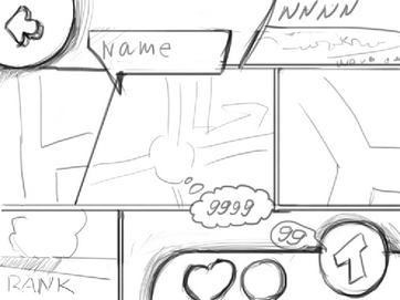
The concept of flat comics, which has been drawn on the sheets, was our first idea:
 |
 |
The customer was satisfied. This concept was in alpha version, but again (ta-da-dam) it wasn’t published. Yes, this happens during the birth of a game: a huge piece of cool work is accepted ... and then rejected.
In fact, the customer decided to change the principles for monetization of the game. Initially, the player had to play with the different talents and get bonuses by increasing the level. After all, it took a lot of conditions, levels, sublevels, also gain experience system and replays were used. Eventually things just got too complicated and serious. Then it was decided to simplify the system by removing all superfluous things and adding bonus cars and opening new maps for cash. This caused a lot of reworking. We have to admit, the decision wasn’t easy. Ultimately, games are created not only because of a love for art, but also to make money.
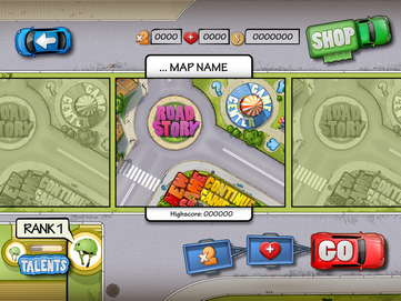
So, being sort of upset, we started to work with new sketches. At that point, the customer wanted to see a block system interface, which is clear and simple, but (we think) spectacular at the same time. We offered several options to choose from:
 |
 |
 |
We stopped at the first option, as we felt it was the most suitable for rectangular maps. Also we were allowed to move away from the urban theme, so we chose a racing theme.

Our game screens are scrolled through by left and right swipes, respectively. When you click on a map, it scales up to fit the screen. This type of interface became a good connection between the start screen and the game maps (which has been tested on friends, children and animals).
We’re moving forward. Game locations – or in our case, maps and intersections – are all different. This was obviously done to diversify the gameplay. In fact, we had to make graphical differences to delight the eyes of all game users. One way we did that was to take users to different latitudes: they can practice directing traffic in the tropics or, for example, or in dense forests.
 |
 |
As for the cars… well, we played a lot with this stuff. I wanted to make a small lad looking on one of them say "Wooow!". We were thinking a lot about adding flowers, but our goal was not only to make things beautiful, but also "playable". Too much range is very visually distracting, and in a quick game you can react to color more than shape.
 |
 |
Last but not the least: the icon. This is always our favourite part, because we want to make this the game really hot. In our experience, a successful icon has a great influence on the number of races. In fact, some people buy games on the AppStore games just for the icon, without really knowing what the game is about. So we immediately drew 2 test sets for our customer. (No surprise there.)
 |
 |
By the way, we didn’t wait for testing on the battlefield. We did our own tests. According to the results, there was an undisputed leader – people liked one of the icons 32% more than the other one. Any idea which one? You can test yourself and take part in the survey.
Well, everything seems to be ready, right? Let’s drink some champagne and have a party! But wait! It’s not that simple. Remember our little world with balloons and cats on the roof? We had to recreate it for the sake of the game’s marketing.
It should be noted that we had to sacrifice not only a cat. Cars were moving along the road on the start screen, and the customer had programmed them to follow traffic rules and not crash into each other. So, in fact, a germ of artificial intelligence was created to allow the cars to overcome the crossroads. But, unfortunately, this screen had to be the first screenshot in the AppStore, and it’s impossible to express all its charm in a static shot. Therefore, we also had to give up the busy street.
Finally, we felt the game lacked personalization. Thus was born the idea of a static final illustration: a girl hanging around at the intersection.
The customer ordered a character who could be definitively associated with this game. The girl had to be beautiful, sexy, hold different modern gadgets and have a sly twinkle in her eyes:

But she wasn’t always that hot. First we did “before/after” stuff, like in fashion magazines. Her final hotness was a process of evolution.
 |
 |
 |
 |
That wasn’t all. We also had to create various dialog boxes, buttons, achievements, and levels. Lots and lots of testing and rework, corrections and redraws. Finally, the game was released.
Yipee! RoadStory recently saw the light of day, and now you can see and feel it by yourself. You can also share your experiences with us and your friends:


You can download Road Story for the Android here. Also you can watch the gameplay trailer here:
We’re the people who put a piece of our soul and talent into it, so we sincerely wish the game to climb to the top of the ratings. Se also hope it helps alleviate boredom and bring a few hours of fun to lots of grateful users.
Download and enjoy!
If you or your friends need some sweet high-grade design for your game, do not hesitate to contact us, we would appreciate serving you with this.